
Survival Coalition
Logo & Advertisement Project
Students were asked to choose an endangered animal to create a logo, illustration, and advertisement. The students worked on each of the requirements at the same time to finish on the deadline. The students were required to provide thumbnails, works in progress, color/layout studies, and explanations of their design. The project included class and professor critiques to review designs for the final output.
Thumbnails
Students provided thumbnails and had to pick their top four to present for critique. Shaped were used to evoke a feeling of protection and strength for the brand. Circle or curved lines surround the Ethiopian Wolf image to show the collation is meant to protect the endangered species. In some thumbnails, triangles were used to show the strength of the company and the animal..
Layout & Color Studies
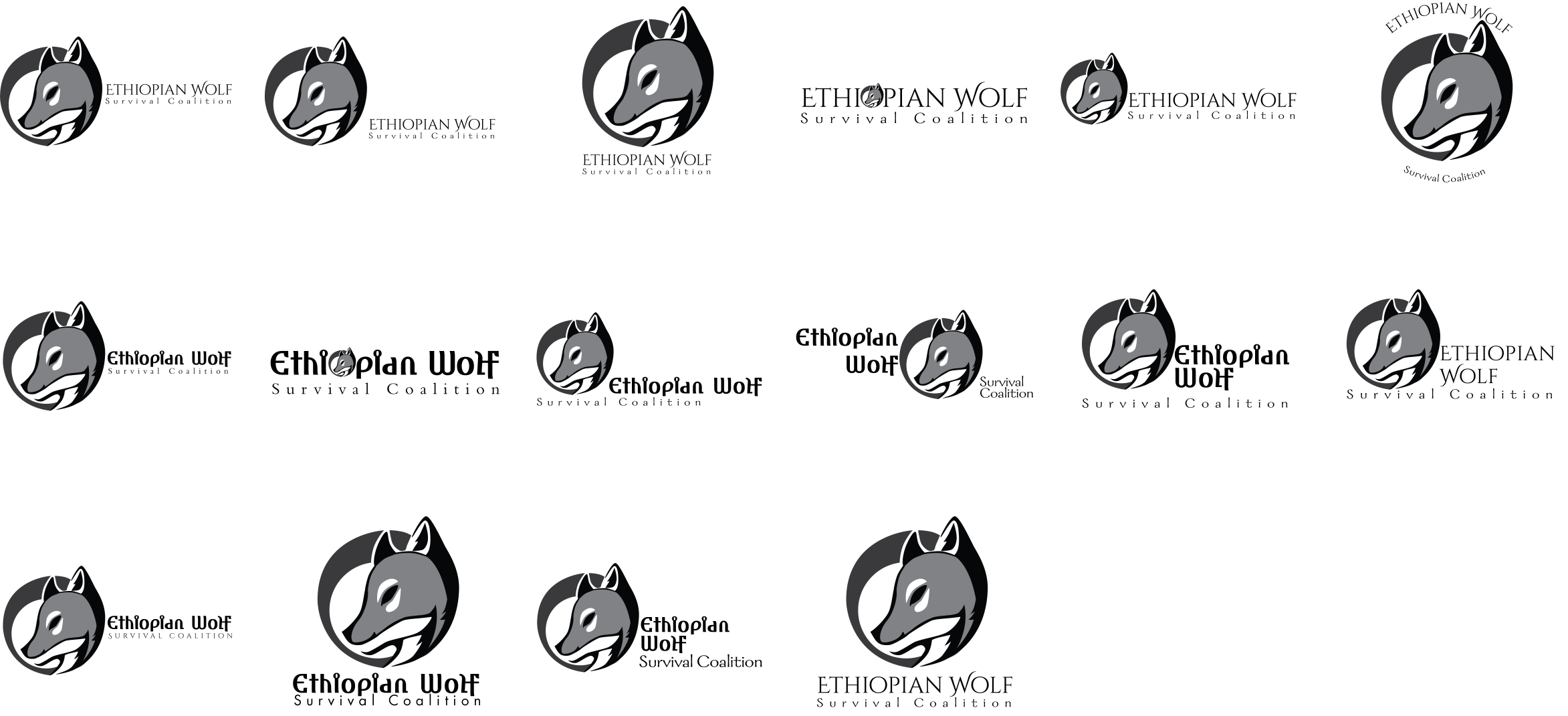
Students had to construct as well as present color and layout studies with their finished logo. After revising the favored logo, large simple shapes were used for readability. For the layout study, different fonts were tested among vertical, horizontal, and square compositions. Different focal points, like the logo image and text, were tested as well. The layout with the best readability and balance was chosen.
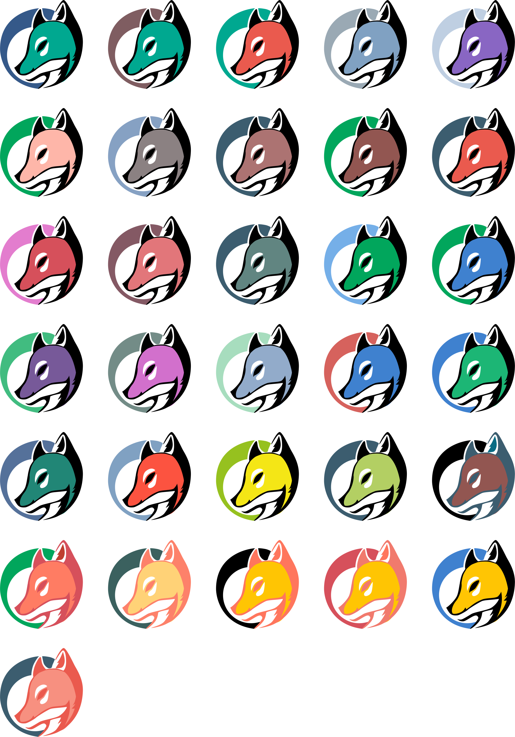
For the color studies, color theory was utilized to test different color combinations. Blue was a reoccurring color to show the safety and calmness of the brand. Energetic colors, like orange and yellow were used to express the ready-to-help nature of the brand.
The color studies and layout studies were critiqued and revised.
Final Output
For the final output, students had to combine their illustration and logo into an advertisement with a headline and a written description of the endangered animal.
For the final logo, the blue circle encompasses the image of the Ethiopian wolf to show the protection the brand provided for the species. The orange of the wolf not only represents the actual color of the animal but the life and energy of the animal as well as the brand.
The final fonts used were Amhara Reduced for the text and Century Gothic for the subtext. Amhara Reduced provided expression to the species while not taking away from the logo itself while Century Gothic alluded to the organization.


